


Watchers 9
athoen
melorix
j90
Ikioi
claued
milktoday
sancho12
andrei75
hansomoto
athoen
melorix
j90
Ikioi
woweek
14R
denull
palindromenoise
incogburo
hansomoto
theRGB
gustaf-pinsel
MolefaceNZ
angelaacevedo
rizn
Collection
Favourites
Collection Coming Soon!
Watch notfreelance to be the first to see new deviations.
Deviation Spotlight


Artist // Design & Interfaces
- United States
- Deviant for 15 years
- www.notfreelance.com/
Badges
My Bio
Personal Quote: "good design takes time"
Favourite Visual Artist
josef muller-brockmann, jan tschichold, max huber, ludwig mies van der rohe, paul rand
Other Interests
design
iso50 feature
0 min read
my martin luther king jr poster campaign was recently featured on ISO50 design blog.
Join the community to add your comment. Already a deviant? Log In
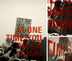
one time you gave a damn
0 min read
Inspired by the current state of affairs and the importance of the coming election, I designed a poster that imposes a critical commentary; it's not your average campaign poster.
I took this opportunity to voice an issue about the loss of progressive values and a lack of positive action from our elders. This statement is intended to force those who have neglected these values to rise again and triumph the message they once stood.
I am currently tied for first so if you appreciate my design, please cast a vote at:
http://www.behance.net/Contest/What-Matters-Most-2008/52607/132504
note: no registration is necessary. enjoy the design, scroll
Join the community to add your comment. Already a deviant? Log In
Profile Comments 15
Join the community to add your comment. Already a deviant? Log In
Cool gallery & favorites 
You have a journal feature.  (Smile)")
o wow, thank you for including my work.
youre so good it pisses me off!
not nearly so; any attempt at ideal form negates any sense of progress. thereupon, quantifying the extent of goodness is completely subjective and thus cannot be used for oppression of any kind. overall, i appreciate your comment.
cute
thanks for the watch^^ your surname in norwegian means: Garden Man. ^^